Loupe, There It Is
I’ve been noodling on a contact sheet UI: strips of black-and-white film on a light table, a grease pencil for circling the keepers, and a loupe you drag over the frames to check focus. The loupe is a vibe-coded WebGL fragment shader.
Making it look like glass meant learning the quirks that give real lenses their character. It is also an ode to skeuomorphism.
Each section covers one thing a real lens does, in a few lines of shader code. The loupe has a dial for each, all on to start. Turn a dial down to correct an effect, or click its name to switch it off.
Hold ⌥ option and the loupe follows your pointer. ⇧ shift pushes it in to 6×. Click a frame to open it, then drag to pan the print. esc closes it.
Try it with everything off first, then add the effects back one at a time as you read.
Needs WebGL. On a phone, the dials are behind a button.The glass
With everything off, the loupe is a perfect lens: a circle showing 2.6× of whatever is underneath, flat and sharp from edge to edge. Real glass bends, blurs, and reflects.
The shader holds the contact sheet as a picture. For every pixel inside the circle, it asks which spot on the sheet real glass would show there, and paints that spot.
It bends
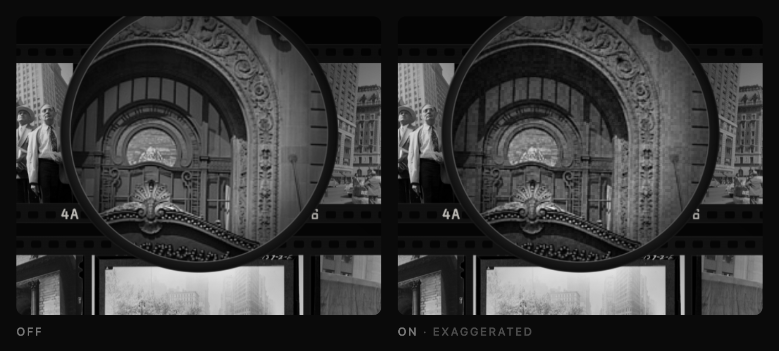
At the rim, a magnifier stretches the image outward. A square’s sides bow in and its corners pull out, the shape of a pincushion. I suspect this is the first thing your eye checks when deciding whether it is looking through glass. Camera lenses tend to do the opposite, bulging lines out like the sides of a barrel. I started there, but the sprocket rails looked wrong as they slid under the rim. The pincushion version felt like glass at once.
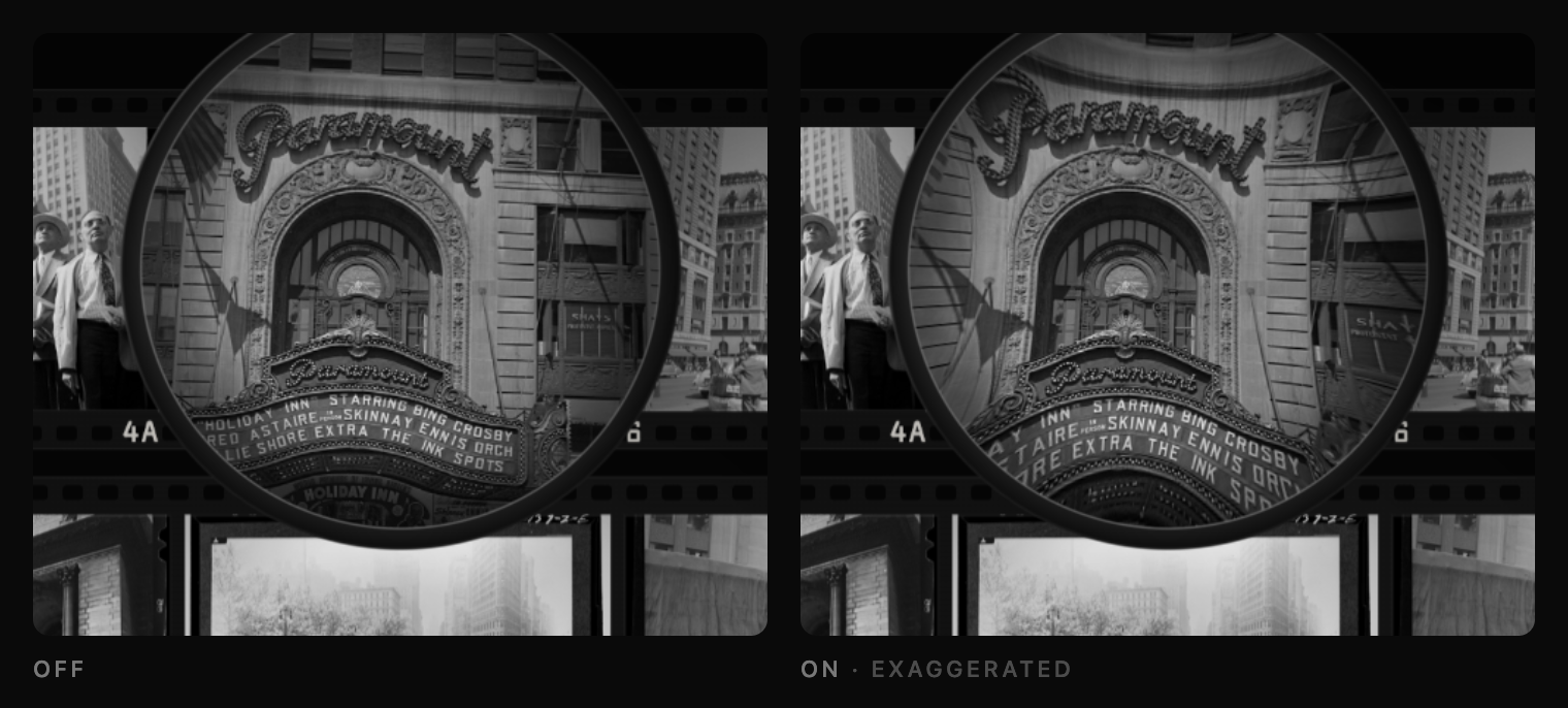
The amount matters. A good loupe is corrected to under two percent; a cheap one might run to ten. I set the demo to eight, enough to feel uncorrected without looking broken. At twenty-five percent it looked like a fisheye and I nearly dropped the idea. Turn the dial up to find where it stops looking like a loupe.
It splits color
Glass bends blue light more than red. A prism does this to sunlight, and a lens is a curved prism. Blue ends up magnified a hair more than red. Toward the rim, the colors drift apart: every edge gets a red fringe on one side and a blue one on the other, wider the further out you go. Lens makers call this lateral chromatic aberration.
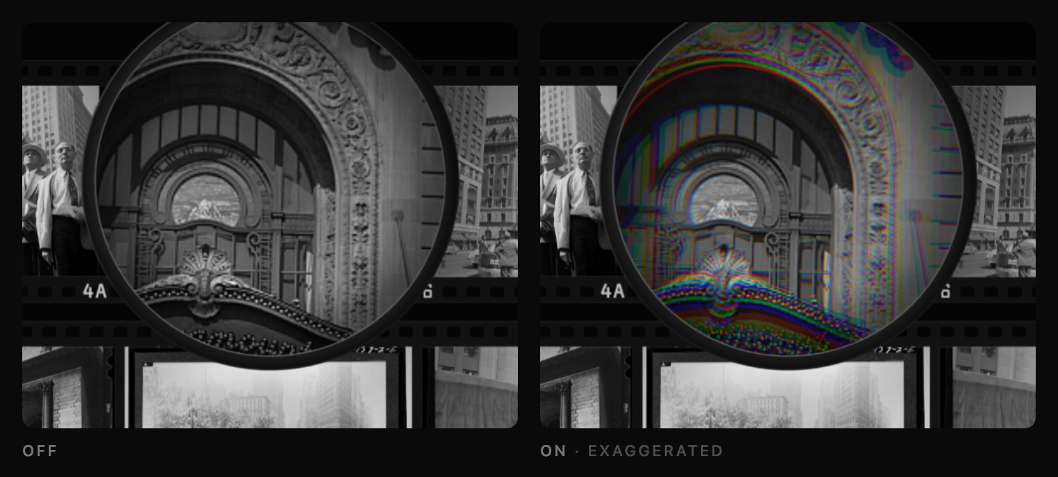
The scans are black and white, so any color in the glass is color the lens put there. The shader takes three samples per pixel, one each for red, green, and blue, at slightly different magnifications.
The rim goes soft
A simple lens does not focus onto a flat surface. Its sharp zone is a shallow bowl. The sheet is flat, so if the center is sharp, the rim cannot be. Out there, points of light smear around the circle or pull into comet tails pointing away from the center. Those are astigmatism and coma.
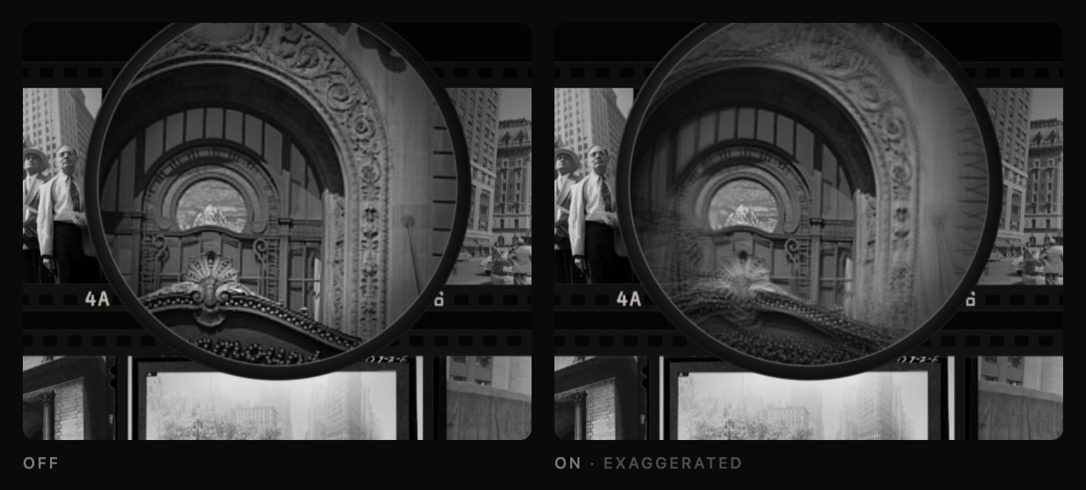
To fake it, the shader samples each color at four nearby spots in a small cross instead of one. The cross widens with distance from the center, so the blur follows the curve of the lens.
Nothing is quite sharp
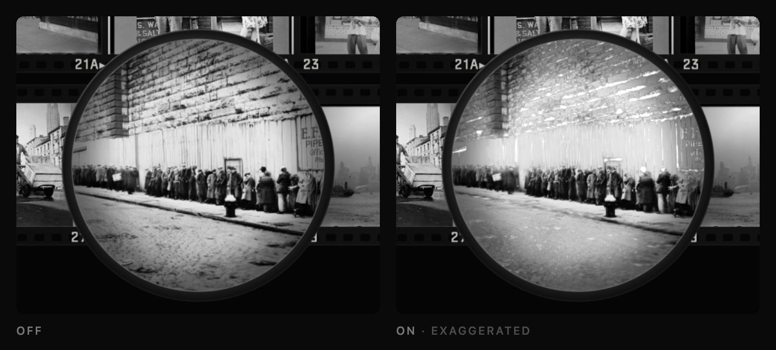
Even at dead center, a simple lens does not focus every ray at the same distance. Light through the outer glass bends a little too much and lands short of light through the middle. Depending on the focus, bright edges spill a soft halo into the dark beside them. A plain blur has no halo. Look at the white walls in the frames.
The push
Hold shift and the loupe pushes in to 6×. The image goes soft while it moves, and the edges pick up a warm fringe. This is the color splitting from earlier, in depth: red and blue come to focus at slightly different distances. Moving in sends red out of focus first. Moving back out sends blue out first. When the loupe stops, a faint magenta edge remains: green is in focus, red and blue each a little off.
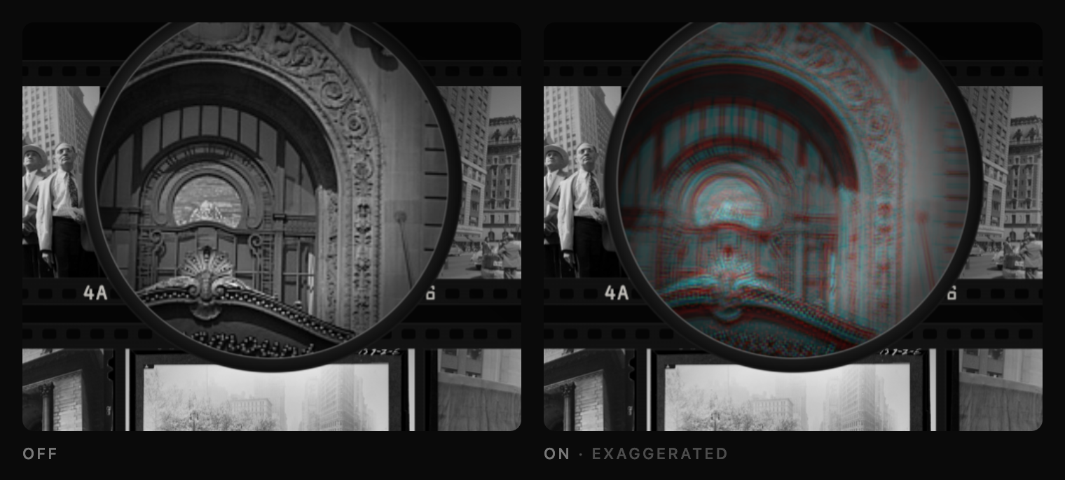
This does more for the sense of depth than anything else here. The direction of the zoom sets the color of the fringe, warm or cool, and the speed sets its strength.
In motion
Flick the loupe across the sheet and the image smears along the direction of travel. That is your eye, not the lens: the sheet under the glass is moving, and you do not get a clean frame. It reuses the four-spot cross from the rim, with the arms stretched along the motion, so it costs nothing extra.
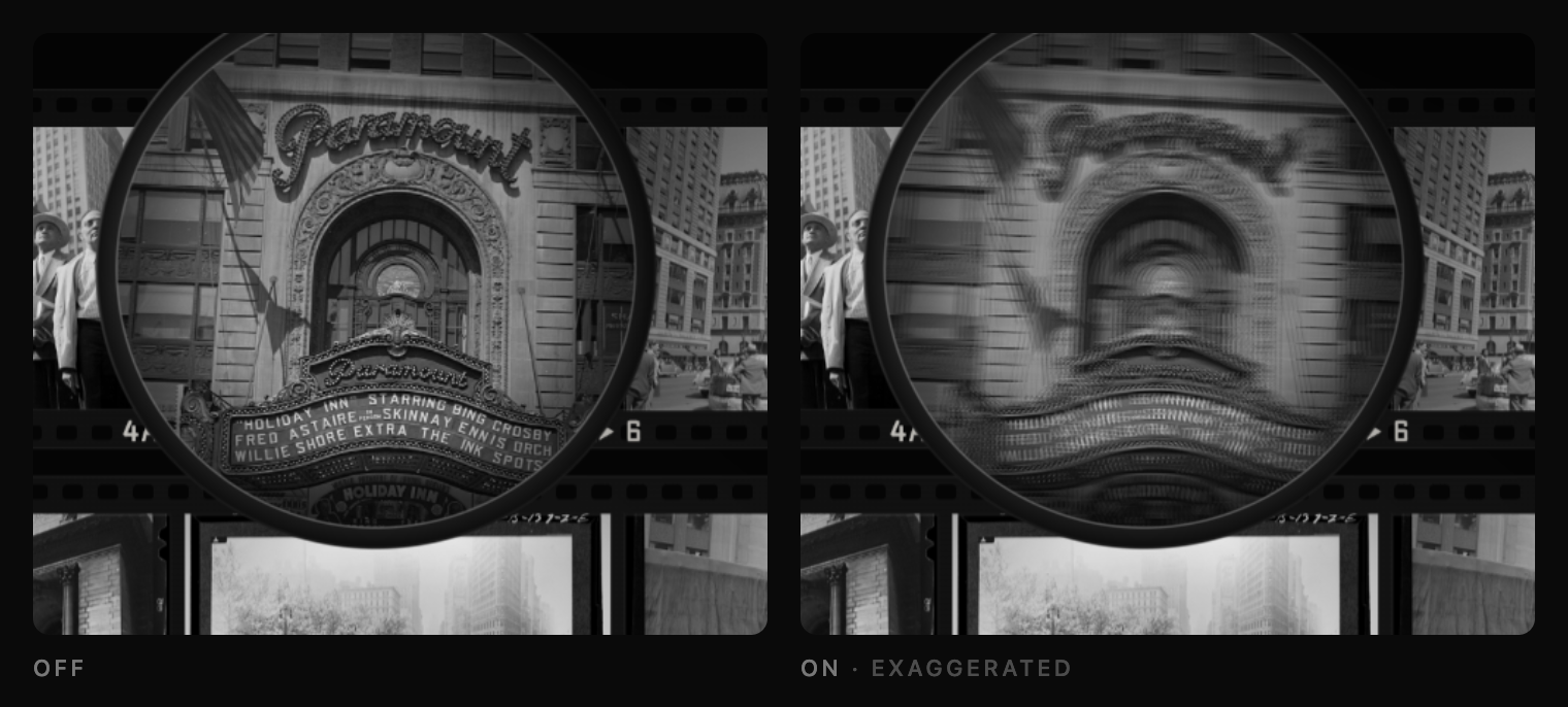
The surface
Glass reflects more when you look across it. Look straight down into a clear puddle and you see the bottom; look across it and the sky takes over. This is Fresnel reflection. The dome of the loupe does the same, so its rim catches more light than its center. A lamp behind and to the right and a window to the upper left show as highlights that move across the dome. I added specks, a thumb smudge near the lower rim, and a faint haze around the lamp.
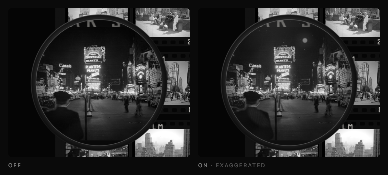
The reflections were my favorite part. A highlight appears where the surface faces halfway between the light and your eye. The glint on a spoon moves when you turn it for the same reason. A little vector math moves the highlights across the loupe as it moves. That is the kind of skeuomorphism I like.
The barrel
The rim is black aluminum. Brushed metal does not shine evenly. The grooves spread light sideways, so the ring lights up in a narrow sector facing the lamp, with a fainter one opposite, like the bottom of a steel pan. The outer edge is knurled for grip, and below it is a clear acrylic skirt, the part resting on the sheet. The barrel casts a soft shadow. The lens gathers light and throws a bright crescent into the far side of that shadow, the way a glass of water throws a bright patch onto the table. Switch this one off and the loupe becomes a porthole.
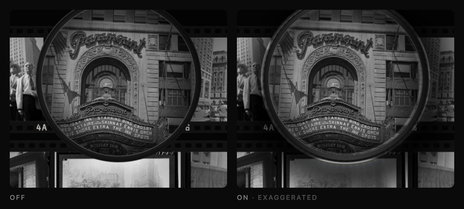
The print
Up close, a print has grain: little clumps of silver, most visible in the gray midtones. Dust on the negative prints white, dust on the print is dark, and there is the occasional hair. All of it is pinned to the sheet, so it stays put and comes back the same on every visit. That is how you can tell it is on the print and not on your screen. It is easiest to see at 6×.
Loupe, there it is
Most of the dials sit under five percent. Turn them all off and nothing dramatic happens. The loupe just gets flatter, cheaper, more like a circle drawn on top of the image. Turn them back on and it starts to feel like something you could pick up.
The full-page experiment lives at loupe.mattrothenberg.com. The photographs are from the Farm Security Administration and Office of War Information collection at the Library of Congress, shot between the late 1930s and 1944, and in the public domain.